-
Welcome to BirdForum, the internet's largest birding community with thousands of members from all over the world. The forums are dedicated to wild birds, birding, binoculars and equipment and all that goes with it.
Please register for an account to take part in the discussions in the forum, post your pictures in the gallery and more.
You are using an out of date browser. It may not display this or other websites correctly.
You should upgrade or use an alternative browser.
You should upgrade or use an alternative browser.
Zeiss SFL 8x40, A Field Review (2 Viewers)
- Thread starter Troubador
- Start date
More options
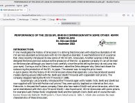
Who Replied?Thank you very much @Gijs van Ginkel for the nice report. Are those values in Table 1 measured values? I have doubts about the Habichts 10x40. Is it really have 16 mm of eye relief? I remember someone mentioned the actual FOV of it is even a few meters larger than the FOV mentioned on the Swarovski website.The results of our investigation of the 8x40 SFL are now on the WEB-site of House of Outdoor.
Gijs van Ginkel
Thank you.
binomaniac
Well-known member

The team from Allbinos measured 110 meters field of view with Habicht 10x40, in the specifications from the factory it appears 108
Each measurement is affected by some error.The team from Allbinos measured 110 meters field of view with Habicht 10x40, in the specifications from the factory it appears 108
108m is under 2% different from 110m. If the error in measurement is 2% or more, you cannot say who is who.
And if it is not measured but calculated...
Example: with 1% error, 108m can be 109 m and 110m can be also 109m.

They're metal.What is the composition of the strap lugs on the SFL?
I think I can even say they are magnesium...they sure seem like they are part of the primary body casting. I've already managed to use mine enough to wear the coating edge and for the metal to show through ---What is the composition of the strap lugs on the SFL?
Gijs van Ginkel
Well-known member
Viraj, post 564,
We measured the eyerelief with a Ramsden dynameter. Furthermore weight, size of exit pupil, objective diameter, and light transmission were measured. We did not measure the FOV.
Gijs van Ginkel
We measured the eyerelief with a Ramsden dynameter. Furthermore weight, size of exit pupil, objective diameter, and light transmission were measured. We did not measure the FOV.
Gijs van Ginkel

not there anymore!Here it is.
Gijs van Ginkel
Well-known member
I did not change anything, it was done by the WEB-master of House of Outdoor.
Gijs van Ginkel
Gijs van Ginkel
Gijs van Ginkel
Well-known member
Ignatius, post 572,
I reread your post and I am very curious what you are talking about, when you wrote "He changed the title and has chosen a dreadful font". We never changed the title and the pictures are all the time identical. The only thing that was corrected was the construction year of the early Habicht 10x40 since it was not 1973 (based on the information I had received originally: but 1984. John Roberts had also indicated to me that 1973 was wrong).
Gijs van Ginkel
james holdsworth
Consulting Biologist
Font looks fine to me , I use it everyday in reports.
Vespobuteo
Well-known member
Ever so sorry everyone, but I find this font terrible to read. So please delete post 572 if at all possible. I shall refrain from butting in in future.
Suspect the "odd" font you are seeing, is picked by your operating system (or perhaps the web browser plugin). I see the same font as usual.
Transmission curve seem to be quite similar to Conquest HD by the way.
james holdsworth
Consulting Biologist
Yes, I don’t see that either when I open the link, just a rather typical font….agree that one is hard on the eyes.
Gijs van Ginkel
Well-known member
When I open the test report file it is exactly as it was designed, so no problem and it is as shown in post 579 by Ted Y.
Gijs van Ginkel
Gijs van Ginkel
Users who are viewing this thread
Total: 3 (members: 0, guests: 3)


